

Ortopedia Battistoni
From the original symbol to a refreshed identity and a website that guides customers through orthopaedic products and services.
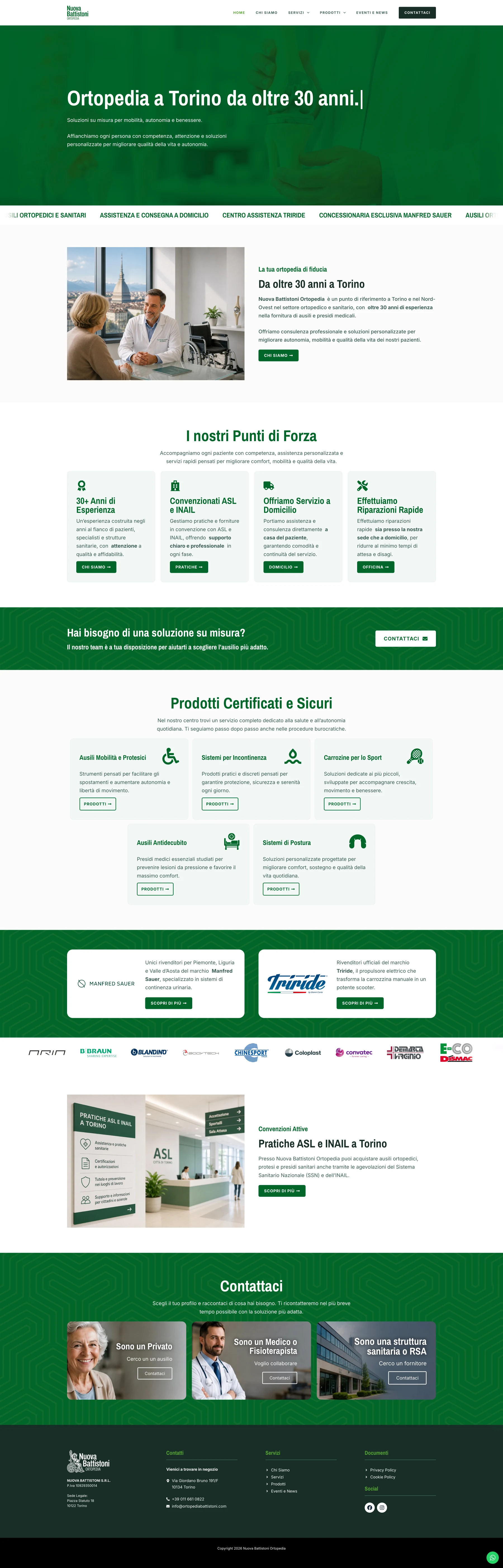

Refreshing an identity does not mean losing what makes it recognisable. For Ortopedia Battistoni, I started with the existing logo and a specific request from the client: keep the original symbol. From there, I developed a new visual identity and website.
The Starting Point
The brand had a symbol worth preserving, but needed a more contemporary and versatile visual language. The aim was to modernise it while retaining continuity with the business's identity and making it easy to use across different media.
A familiar symbol, a new form
I redrew the symbol in a flat style, simplifying its shapes and making the logo more pared back. I then defined the colours and visual style, creating a consistent foundation for the website and other brand applications.
A website that helps people find their way
With the visual direction established, I built the website around the information people need when looking for orthopaedic aids. Products, services and contact details form a clear path that helps visitors learn about the business, understand what it offers and contact the centre about their needs.
The design carries through the colours and style of the refreshed identity, maintaining continuity between the brand and the browsing experience on desktop and mobile.
The Result
Ortopedia Battistoni has an updated identity that preserves its original symbol and a website consistent with its new style. Two parts of the same task: make the business recognisable and give customers the information they need.
Have something similar in mind?
Tell me about it. In a free 20-minute check, we work out what you need and where to start.