

Nebrodi Enduro Tour — Website

From identity to the first enquiry

The website was the second step for Nebrodi Enduro Tour, following the logo and brand identity. Its purpose was to bring the experience online: introduce the trails of the Nebrodi mountains, present the tours and make it easy to request information or a quote.

Starting with what we had

The business was still taking shape. I structured the content and used photographs and GoPro footage from real rides to tell an authentic story of the landscape and the sport. The website follows the brand identity, with clear routes through tours, the region and the team, on desktop and mobile.

Launching to learn

We launched before the business was fully ready, to test interest and generate the first enquiries. Requests for information and quotes arrived after around three weeks. Analytics data and campaigns on Meta and Google then helped identify the most interested audiences and locations.

A path towards greater visibility

The website, content and promotional work helped Nebrodi Enduro Tour reach the first page of Google for “sicilia enduro tour”. An online presence built to reach interested riders and turn visits into meaningful enquiries.
Explore the Nebrodi Enduro Tour brand identity →

Indaco Med

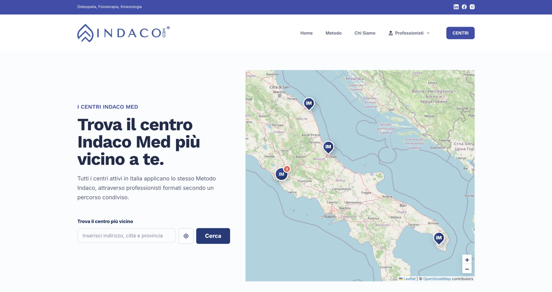
Indaco Med has centres across Italy. Its website needed to explain the method and help each visitor find their nearest centre. I handled the design and development, then built the feature that connected these two goals.

The Project

I designed the website around the brand identity and built it with WordPress and Elementor, so the client can update its content independently.

For the centre search, I developed a custom WordPress plugin: it brings together Indaco Med locations across Italy and, with the user's permission, uses their location to identify the nearest centre. The feature helps people move from discovering the method to choosing a location.

Why a custom plugin

Existing tools are a good starting point. When a project needs specific behaviour, however, I prefer to build the feature around the client's requirements.

For Indaco Med, this meant bringing the directory, geolocation and nearest-centre search into an experience consistent with the rest of the website. This is where my development experience comes into play: I choose suitable tools and build the custom features needed to deliver what the project actually requires.

The Result

Visitors can learn about the Indaco Med method, browse the centres and find the one closest to their location. The client has a website they can update and a feature built for the needs of their network.

Technologies

WordPress, Elementor, a custom PHP plugin and geolocation.

Wellnext Sport Club

I have worked with Wellnext for almost ten years. During that time, the website has been redesigned three times, because a sports centre changes, and its website needs to change with it.

The Starting Point

A sports centre has a lot to share: classes and timetables, activities, services and the philosophy behind them. Visitors, however, first want to answer one question: ‘Is this right for me?’ My job is to make that answer clear and guide them towards the information they need.

What I Built

I organised the content into straightforward paths: people looking for a class can find the timetable, those exploring the centre can discover its activities and services, and those interested in its approach can learn about its values. The structure helps visitors find their way on mobile and desktop, without searching through scattered information.

Three versions, one method

Each new version responded to a real need: new classes, new services, changing visitor habits and more modern web tools. Before every redesign, we look together at what works, what can be simplified and what is missing. From there, we decide what to build.

A website that keeps growing

After almost ten years, the website remains an everyday working tool: the centre continues to update it and use it to communicate what it offers. An ongoing collaboration lets it evolve alongside the business.

Harley-Davidson Torino

A Harley-Davidson dealership website needs to convey a recognisable world and help visitors take the next step: choose a motorcycle, learn about the workshop or make an enquiry. For Harley-Davidson Torino, I built this online presence and later a dedicated Shopify shop.

The Starting Point

The aim was to follow the manufacturer's guidelines for the official brand kit and bring Harley-Davidson's character to the web. At the same time, the website needed to clearly present the dealership, authorised workshop, new motorcycle range and available used motorcycles.

Identity and content, working together

I designed the website around the brand identity, giving motorcycles room to stand out and organising content around visitors' different needs. People looking for a new motorcycle can explore the range; those considering a used one can browse available stock; existing Harley-Davidson owners can find workshop services and a direct way to contact the dealership.

A dedicated shop

After the dealership website, I built a Shopify e-commerce store on the separate domain harleytorinoshop.it. It provides a dedicated online sales channel alongside the website, with an identity consistent with the Harley-Davidson world.

Visit the online shop

The Result

Since launch, the website has generated many enquiries and supported the dealership's sales, particularly of used motorcycles. Its online presence has become a meeting point between interested buyers, available motorcycles and the company's day-to-day work.

Ortopedia Battistoni

Refreshing an identity does not mean losing what makes it recognisable. For Ortopedia Battistoni, I started with the existing logo and a specific request from the client: keep the original symbol. From there, I developed a new visual identity and website.

The Starting Point

The brand had a symbol worth preserving, but needed a more contemporary and versatile visual language. The aim was to modernise it while retaining continuity with the business's identity and making it easy to use across different media.

A familiar symbol, a new form

I redrew the symbol in a flat style, simplifying its shapes and making the logo more pared back. I then defined the colours and visual style, creating a consistent foundation for the website and other brand applications.

A website that helps people find their way

With the visual direction established, I built the website around the information people need when looking for orthopaedic aids. Products, services and contact details form a clear path that helps visitors learn about the business, understand what it offers and contact the centre about their needs.

The design carries through the colours and style of the refreshed identity, maintaining continuity between the brand and the browsing experience on desktop and mobile.

The Result

Ortopedia Battistoni has an updated identity that preserves its original symbol and a website consistent with its new style. Two parts of the same task: make the business recognisable and give customers the information they need.