Nebrodi Enduro Tour
A passion becomes a business idea
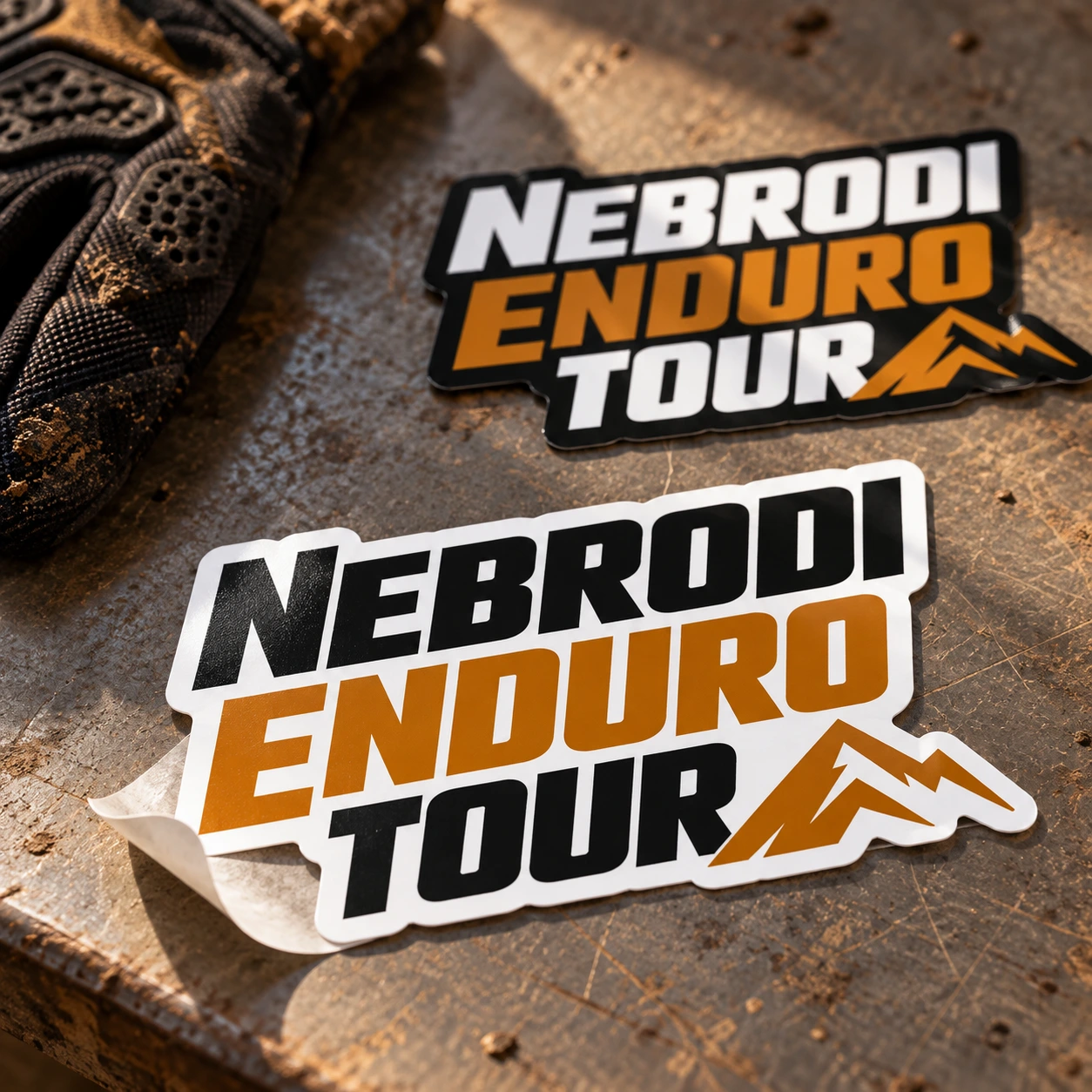
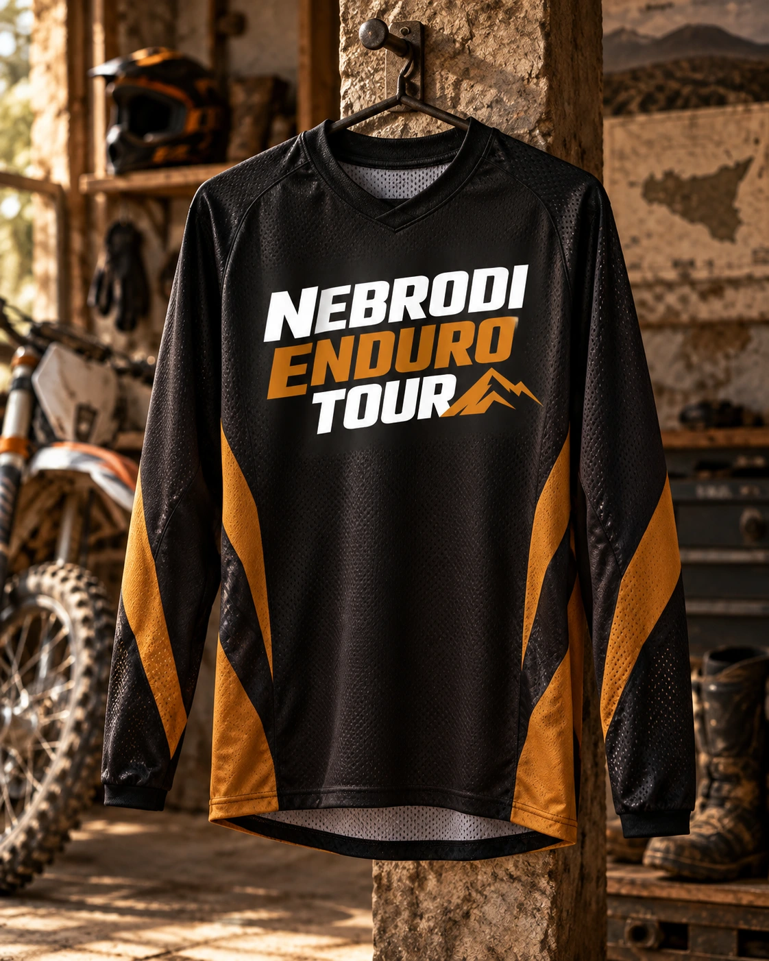
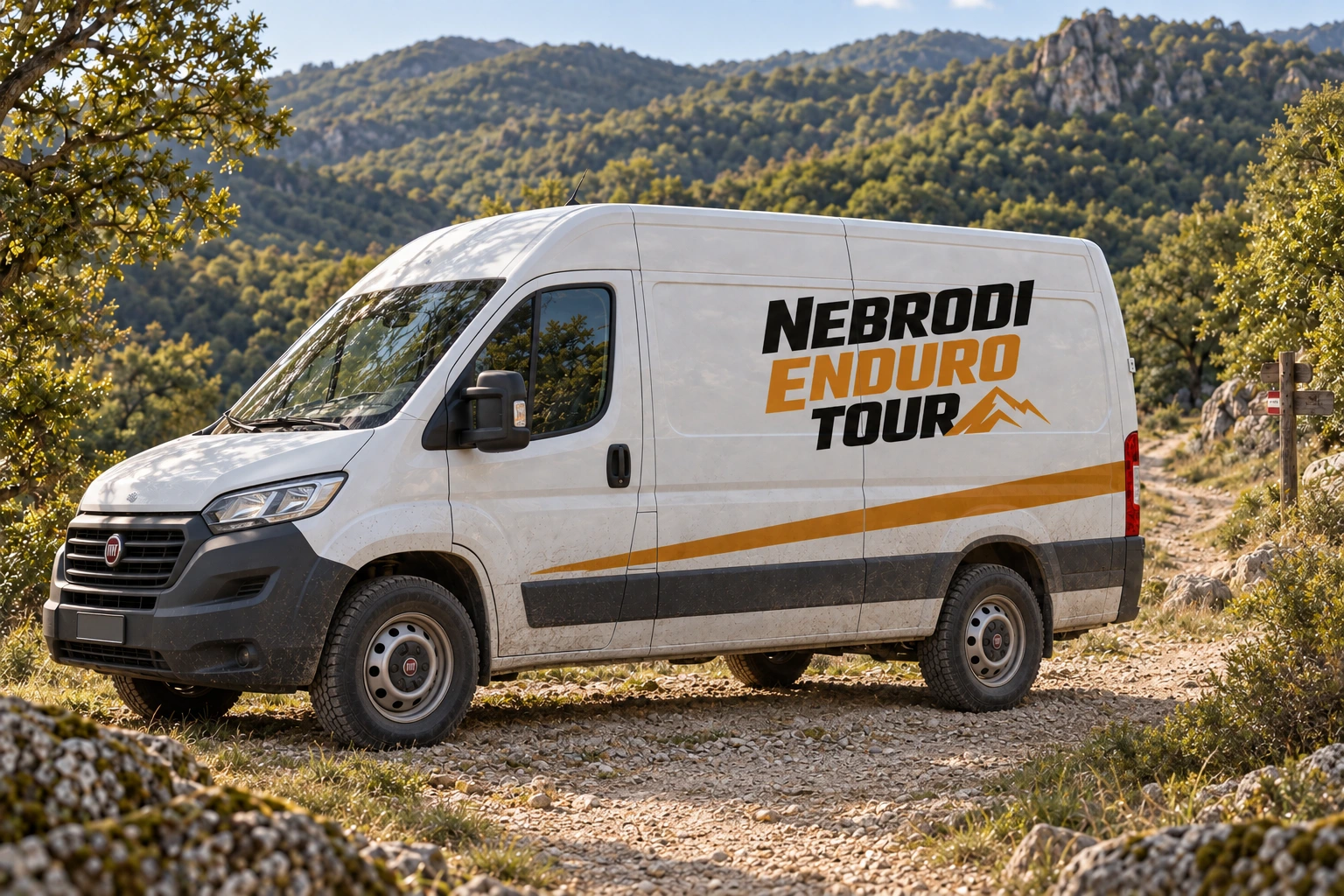
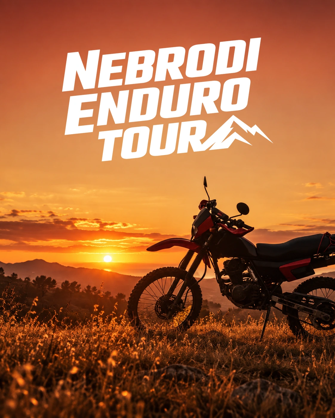
Two enduro enthusiasts wanted to turn their rides into an experience for other riders, introducing them to lesser-known trails in the Nebrodi Mountains and the Messina area. Starting with the brief, I developed a strong, recognisable identity: dynamic lettering, a mountain symbol and an earthy colour palette.
From logo to online launch
I worked on both the branding and the website while the business was still taking shape. To communicate the experience, I used GoPro footage from their own rides: authentic content already available, allowing us to launch and see whether there was interest. Analytics and campaign data then helped define the audience and guide activities on Meta and Google.
From idea to first enquiries
The first website enquiries arrived after approximately three weeks. The project also reached Google’s first page for the search “sicilia enduro tour”: identity, online presence and communication developed together to reach people with a real interest in the experience.
The mockups show possible applications of the identity.